Forgotten furniture to beloved icons:
A stroll through Liverpool’s sculpture-filled streets
Written for The Liverpool Post, 04/01/23
River of Light is regularly namechecked as one of Liverpool's most popular events. Last year's outing, the fourth for the series, was "hailed the most successful ever", crowed Liverpool Chamber of Commerce, "with around 150,000 people enjoying the free, outdoor trail". And it's easy to see why: it's colourful, it’s vibrant, it lends itself just as well to neon-lit selfies as it does to a stroll before your group retreats, shivering, to the pub.
This state of things does feel a bit unfair, though, given how much public art in Liverpool gets entirely overlooked. For one thing, most artworks don't have the marketing force behind them that River of Light does. But the illuminated artworks also have one key advantage: novelty. If something's always there, it’s hard to respond to it with the same excitement. Which prompts the question, what should public art be? Should it be permanent, temporary, an enduring favourite or a gorgeous flash in the pan?
In hot pursuit of answers to these questions, one Sunday I headed out on a sculpture walk hosted by local arts and culture website The Double Negative. They started hosting these walks in 2019 after Denise Corcoux wrote an essay comparing two sculptures in town in their book Present Tense, a result of the fellowship they ran that reflected on the ten years since Liverpool was the European Capital of Culture.
Running down the hill to the meeting point, the Myrtle Street 92 degrees, there was already a gaggle of 20 people waiting, primed and ready to set off towards the university campus. I recognised Mike Pennington and Laura Robertson on sight — they run the Double Negative — but they were wreathed by plenty of new people, too. Such as Maria, a Belarusian who had recently relocated to Liverpool to work at the Open Eye Gallery, and Andy, a retired librarian from Huyton with the sort of quiet demeanour you might expect, given his former job. Eventually we'd count Boo amongst our number — a former racing greyhound who joined us for the second half of the walk.
Starting the tour traipsing through rows of grey office blocks was possibly a stroke of strategic genius on Pennington and Robertson's part. Expectations were not so much low as subterranean. What were the chances of encountering creative flair in such a rigid environment?
But on London Road, we struck gold. Head between Sketch Bar and City Style Barbers, in what is essentially an alley, and you’ll find two metal chairs. They are painted black, and are all harsh right angles. From each of their bases, carved in the concrete below, circles emanate like ripples, overlapping in between as the hard chairs join together through the smooth edges of the circles. The Ray + Julie Chairs, named for some graffiti that used to be in the alley, were installed in 1995. The chairs were created by married artists Alan Dunn and Brigitte Jurack.
Set back from a busy road, it’s a quiet respite where two people can sit and talk, and it transforms the noise of the city into an intimate space. It’s quite romantic. It came from Dunn and Jurack, whose personal romance is clear, but it is named for the mysterious Ray and Julie, known only through an old piece of graffiti. These chairs gesture at romance but they don’t limit themselves to it. Anyone could be Ray and Julie.
I sat on one of the chairs, the other empty across from me. It was hard and low enough to the ground that my long legs sprawled before me. Its position forces you to square up to the other chair, reminding you of a space for another person. Even though there were other people just metres away, it felt isolated, its own little bubble, just me and a chair.
On the walk, Pennington explains that due to its location, most nights Ray and Julie are usually two drinkers waiting for a taxi or bus home, and I must admit that the only way I had previously interacted with this is as somewhere to rest on the walk into town. Commissioned as a part of Visionfest, an annual festival run by John Moores University from 1992 until 1996, it was only intended to stay in place for six months. The chairs stayed, but the graffiti is gone, and murals have appeared in its stead.
The alley is dirty, with litter dropped by the neighbouring businesses’ bins and moss and weeds cropping out of the cracks in the concrete. There is a strange disconnect between these murals, the chairs and the trash. It’s a contrast between a deliberate placement of the chairs, the responsive murals that came after, the littering, and nature’s pressures, that reveals what happens to public art after it’s installed.
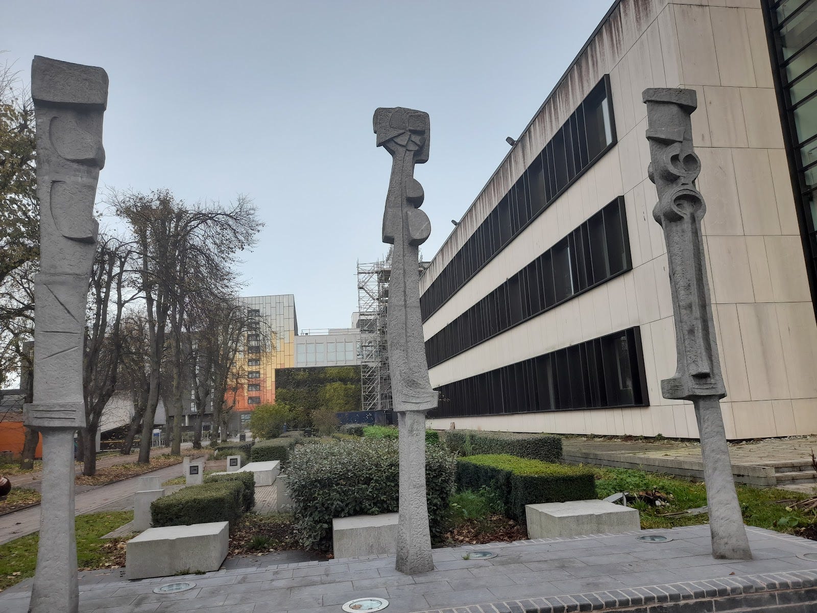
Ray + Julie exists in roughly the same state as it was built. In other places, the works we saw have been changed, rearranged, dirtied, cleaned, moved around. One of the first pieces we came across on the University campus was Hubert Dalwood’s 1959 sculpture Three Uprights at the centre of the University of Liverpool campus, sitting between Abercromby Square and Brownlow Hill, installed in Liverpool shortly after he won the John Moores prize.
Its three columns stand apart, their purpose unclear, each with complimentary details, two round extrusions or cut outs towards the top make them look like puzzle pieces that could fit together. One man on the walk noted how the aluminium that they were made from had been cast in a way that made them look concrete. I love the mystery of these, that their material and purpose is obscured. Once, years ago, they were close together, huddled, whispering. But now they are pushed apart, their secrets even more hidden. This adds to the mystery but not in the way the artist intended, and probably without much thought to the art’s meaning. They were moved when the University redeveloped the walkway to have some more greenery and seating.
A different location isn’t the only thing that changes an artwork. Left over from another festival (this time celebrating Liverpool’s 2008 status as the European Capital of Culture), Richard Wilson’s Turning the Place Over cut into the side of an abandoned office block over the old Yates’s Wine Lodge across the road from Moorfields train station. Now it sits still, but when it was first installed the cut out would spin around, breaking open the building’s facade, revealing complex engineering that makes it turn mixed in with the birds’ nests and rubble of the abandoned building.
Even unmoving, the cut out is striking, with no context it’s an intriguing, industrial mystery. But moving, it became iconic. On the walk, Denise spoke about how it became a “YouTube moment” for the City of Culture year, becoming a wayfinder for entry into the city through the business district. The building was planned to be knocked down to make way for some green space amongst the concrete, making an open space outside the train station. This never happened, and instead Turning the Place Over span for years longer than was originally planned. It’s a temporary work with a happy ending, of sorts — becoming a permanent feature of the landscape.
Of sorts, because in 2011 it was switched off. It’s expensive to run the kind of machinery that is needed for something like this, but, in 11 years nothing has been removed, that green space was never developed. Denise called it “the ghost of an artwork.” What was once on its way to being an icon now sleeps. It doesn’t do what Wilson intended it to do anymore, it doesn’t reveal anything hidden inside the walls of this innocuous building. But it hints at something there.
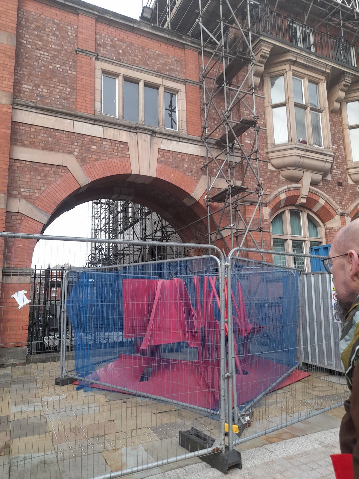
With more nurture Turning the Place Over could have been an icon for the city. We’ve seen it happen elsewhere, with Taro Chiezo’s Superlambanana becoming a divisive civic symbol over the last 25 years, which we also visited on the walk. Some people thought that the giant mutated yellow lamb was a friendly face for the city, while others thought the cutesy kitsch surrounding it went too far.
More recently, Liverpool Mountain by Ugo Rondinone has become a wayfinder for the Tate and Albert Dock more broadly, and, in Mike’s words “an Instagram moment” to Turning the Place Over’s YouTube moment. As we waited, a couple on holiday posed for pictures in front of it. This bright icon seemed broadly liked on the walk, though one person did call it a “garish monstrosity” before performing a 180 — actually, he said, he quite liked it. I get that: sometimes the best art sets your teeth on edge before you suddenly realise that the discomfort it elicits is exactly what you like about it. Its neon boulders are a perfectly balanced Jenga tower that you want to push against to see how well balanced it actually is. These works are both large, striking, and colourful, they’re slightly uncanny in how comfortably their incongruous shapes fit into their environments. They are fun and unpretentious. These become embraced as a part of their place.
At its best, public sculpture interacts with the world around it. Red Between by Phillip King sits behind the Victoria Gallery and Museum on the University campus. It’s a tangled web of metal work, made of sloping sheets and tubes all painted in primary red. Its creator wanted to make work that was “of” nature, rather than “about” it. The bold colour and use of metal may seem not especially linked to nature at first glance, but the shapes draw out the connections, allowing wind and rain to move through the sculpture dynamically.
John Donne once wrote that no man is an island, and I'd venture that this could be extended to public art, too — unlike works in the white cube of the gallery, public art is anything but self-contained. It's a collaboration — between the art and the landscape surrounding it, and you, the viewer (who unlike in a gallery, might be prompted to touch it or sit on it or, if you've had a couple of pints too many, maybe even to climb it). While public art’s ability to fade into the background might seem like an insult to the format, ultimately, it’s the biggest compliment of all. The art becomes part of the city itself.